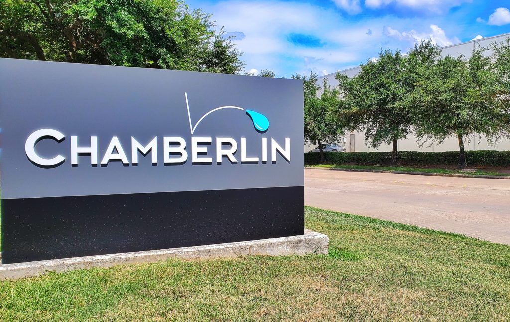
Monument signs are a great option for businesses looking to make a strong statement. Their solid construction and bold titles can make them into instantly recognizable landmarks. However, an improperly designed monument sign can be unreadable, or even worse, it can fade into its surroundings.
Fortunately, you can greatly improve the impact of your sign by following a few simple guidelines. With a little bit of planning and collaboration with a good sign company, your monument sign design will be well ahead of the curve.
Simplicity
Perhaps the most important tip for monument signs is to keep them simple. People don’t have time to read a lot of text as they drive by your sign. Therefore, most monument signs don’t need more than a logo and perhaps the address.
If you do have more than one element on your sign, make sure they’re not the same size. More people will be able to read and understand your sign quickly if you maintain this visual hierarchy. The logo or company name should be big and bold, while further information should be smaller and more subtle.
Contrast
If you want viewers to be able to read your sign at a glance, you need strong contrast. This can be as simple as placing light text on a dark background or vice versa. Unfortunately, many beginner designers make the mistake of thinking that all of their colors need to be bright and vibrant. For example, have you ever tried reading bright red text on a bright blue background? It’s not pleasant.
You’ll also want to watch out for carved or chiseled monument signs. While these designs have a great classic look, they can sometimes be hard to read if there’s not enough contrast between the lettering and the surrounding stone. A good sign fabricator will know how to avoid this problem and make sure your sign is legible.
Lighting
Often, monument signs are lit by external light sources at night. While there’s nothing wrong with this, you shouldn’t forget that your monument sign doesn’t have to be a solid piece. Talk to your designer about lighting your sign with LEDs from the inside for a more modern look.
If your monument sign incorporates 3D elements such as channel letters, your choice of lighting can elevate your design to the next level. If you choose external lighting, you can play with the angle to produce the right amount of shadow. Lighting channel letters from within help add extra depth and dimension to your sign.
Landscaping
Apart from the sign’s design itself, you can also use landscaping techniques to help make your monument sign pop. That doesn’t mean you necessarily need to plant new trees or shrubs. Instead, you may be able to place your sign in a way that allows your existing greenery to frame it well.
Some landscaping options include placing your sign next to a tree for some natural shade, putting it in front of some existing greenery for a nice backdrop, or even planting flowers or short shrubbery in front of your sign. Just make sure your groundskeeping team knows not to let your sign become obscured!
Materials
Another aspect of your monument sign that bears thinking about is the material used to construct it. You’re not limited to choosing just one material, so consider mixing it up a bit. For example, you could combine elements like brick, brushed metal, stone, or wood to create a much more eye-catching sign.
Look to your building for inspiration. If you have a red brick building with prominent metal doors, you could construct your monument sign to match that aesthetic. It’s a very high compliment when viewers assume that your sign and your building were made at the same time.
Wayfinding
While you normally want to limit the number of elements on your sign as much as possible, you might be able to improve customer experience with some helpful directions. You shouldn’t need more than a small amount of text and an arrow. Hospitals and college campuses often take advantage of their monument signs to help visitors know where they need to go.
As you add on wayfinding elements, don’t forget about your visual hierarchy. Your logo or business name should still be the most prominent part of your design. Remember, you want the logo to be seen from down the street. The directions don’t need to be visible until the viewer is ready to turn into your driveway.
LED Displays
Monument signs are also great for framing an LED screen. This screen could make up your entire sign, or it could work in conjunction with a physical logo. The large, solid construction of a monument sign will help draw viewers’ attention to the screen, greatly enhancing the effectiveness of your sign.
With an LED screen, your options are almost limitless. For example, you can display dates and times for sales and other special events, celebrate holidays, show product videos, and so much more.
We’re Ready to Make Your Monument Sign
National Signs has the skills and experience to be your one-stop shop for monument signs. We can guide you through the design, fabrication, and installation processes so you end up with the perfect monument sign design for your business.
Ready to get started? Contact National Signs today.


