When you share a commercial sign, it’s easy to fade into the background. But a shared commercial sign is also a great way to access prime sign real estate when you can’t otherwise afford it. With the right marketing strategy, your shared sign can be highly effective. Here are five ways to stand out when you’re sharing a commercial sign.
Choose Sign Partners Carefully
Depending on where the sign is featured and who designs it, you may be able to choose which businesses are displayed on the sign with you. You might even consider joining a pool with several local businesses to approach a sign manufacturer about a shared sign. If you’re able to choose with whom you share the sign, follow these tips:
- Select businesses that complement your own operations. A doctor might work with a pharmacy and medical supply manufacturer, while an electrician might partner with a plumber and roofer. Ensure your sign is never displayed along with competitors’ signs.
- Avoid partnering with businesses that might harm your reputation or make you appear smaller than you are. Very new and small businesses often want to partner with bigger operations. Likewise, those that get little respect in the public eye may want to be displayed along with beloved churches or nonprofits. Choose a business with a similar size and philosophy to your own.
- If you can’t choose with whom your sign is displayed, ask if you can at least veto certain businesses.
Select the Right Color Scheme
When every business on the sign uses the same color scheme, it may be more attractive to passersby. But it also increases the likelihood that each individual business will fade into the background. Choose a color scheme that stands out. To avoid a tacky sign, your color scheme should complement, but not match, the design other businesses on the sign use. It’s also helpful to use high-contrast images to quickly catch the eye of potential customers.
Get Some Design Help
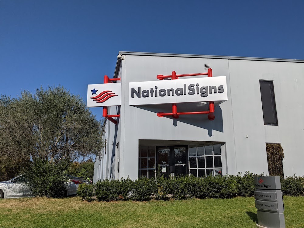
Unless you’ve done a lot of marketing research and you know your sign and logo design work well across contexts, get design help from a pro. The right sign company can make simple design tweaks that help your sign pop. National Signs works with our customers to create beautiful, professional-looking signs that attract the right kind of attention. We can work with you to decide on the perfect color scheme.
Keep The Message Simple
Cluttered shared signs are inherently overstimulating. Most customers are unable to take in the individual messages of each business. Instead, they focus on one interesting ad, then move on. So in addition to creating a design that attracts attention, you must also keep your message simple. Don’t design a sign that’s covered in small text. A consumer may only look at your sign for a split second. If they can’t take in all the relevant information in that time period, your sign does you little good. Note that visual cues are often more effective than words. So for example, instead of saying you offer compassionate care, try showing an image of a person being compassionate with a customer. Pictures are easier for the mind to digest, and they free mental space for customers to jot down your phone number or website.
Negotiate Your Position
Your position on the sign matters. The “best” position depends on the sign. If you’re on a smaller sign, the best position might be at eye-level. The top position on a giant outdoor sign is often best. So seek advice from a marketing expert or a sign designer. Then ask if you can negotiate your position on the sign. Paying a few extra dollars for a better position is still cheaper than paying your own sign. And the odds are good that the extra business you attract will more than compensate for the extra funds. National Signs can help you design the right sign for every budget, every setting, and every design challenge. Take a look at our gallery to see our signs in action. Then give us a call!


