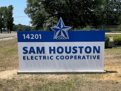
As an architect or designer, you know that exterior signage can help your clients make a bold statement about the building, its function, and the businesses. Custom sign creations can help you take the next step by adding flair to a building that will attract customers to the space.
However, it’s essential that any custom sign complements the building architecture and enhances the brand instead of clashing with existing elements. Striking the right balance is especially important when creating large custom signs for properties such as tall buildings, office parks, and event venues. Let’s take a closer look at how to conquer the challenge!
How to Serve Your Customers Through Custom Sign Creations
These pointers can help you think through how best to serve the needs of your clients.
Consider Design Functionality and Style
When it comes to custom sign creations, detailed design is crucial. Signs let potential customers know what the business offers and to what demographic it caters. A sign should reflect the brand and image of the company.
For example, if your client focuses on luxury items, the sign’s coloring, style, and font should have an upscale feel. If a client offers something fun or funky, then brighter colors and a more playful font can let customers know what to expect from the company.
When you’re considering design concepts, it can be exciting and beneficial to think outside the box. However, sometimes, signs can be a bit too custom. For example, you or your client might want a bold, eye-catching logo, fun fonts, and bright colors that present all of the information about the company. With signs, though, like much of branding, less is often more. Too much detail can be distracting. It can detract from the look of the building and take away from the purpose of the sign.
Most people only look at a sign for a few seconds. If a sign is packed with words and pictures, the message can be lost, and people might not even get a feel for what the business offers. Instead, we recommend stressing readability:
- Only use between one and three easy-to-read fonts.
- Text should stand out against its background but shouldn’t fight with the colors around it.
- Think about how the sign will represent the business and how it will look on the building.
- Always take the building’s architectural style into account when thinking through design ideas.
Neon signs are a great design example. These signs use just one or two bright, eye-catching colors and generally utilize only one font. Any more, and the sign would feel too cluttered. As is, the simple design provides a clear message about what the business offers, and the neon styling tells customers about the tone of the business.
Walk Through Custom Ideas with Your Client
It can sometimes be difficult for clients who aren’t versed in sign design and installation to get a feel for crafting the perfect sign for their space. Oftentimes, they might ask for more details or words that look great on paper but might not translate well on the sign itself.
If a client feels strongly about design elements that you think might not work, it can be helpful to learn why they like those elements. Then, you can break down the design and use specific colors, simplified logos, or fonts that the client likes to help steer them away from a more complicated design that may not translate well.
From our experience supporting sign design projects, we have found that it’s best to pursue compromise on a design that offers information at a glance while still representing the company and acting as a beautiful architectural accent.
Work with Sign Professionals
Designing custom signs doesn’t need to be stressful. Working with professional sign fabricators such as National Signs can often help simplify the process. We genuinely enjoy working with architects and designers to bring ideas to life.
We offer end-to-end sign solutions that include design support, fabrication, permitting, installation, and repairs. Because of our expertise, we can answer even the most detailed questions from your clients, helping you create a perfect custom sign design that makes a statement without taking away from the building’s appearance or the sign’s purpose.
Find a Collaborative Partner for Custom Sign Creations
Designing a custom sign can seem challenging, but at National Signs, we aim to make every design experience as straightforward and enjoyable as possible.
Working with our design and installation experts can streamline your project and help you determine whether an idea is actually doable. We’re happy to collaborate with your team and offer insights about how to turn your custom sign ideas into an executable project.
Reach out to us today for a consultation about how we can help. We look forward to offering our expertise to support custom sign creations for your clients!


