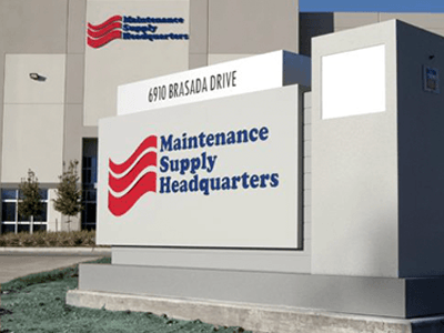
No matter where you go, you will always find signs. If you’ve been around for a while, you’ve probably noticed some changes in the look of the signs you’ve seen over the years. That’s because modern signage design is constantly adapting so businesses can catch their customers’ attention.
Are you ready to dive in to learn more about custom signage that reflects the latest trends? In this article, we’ll go over the factors that impact modern signage design — and some future trends to look forward to!
What Impacts Modern Signage Design?
Several things influence signage design trends. Some are practical issues such as price, availability of materials, environmental concerns, and safety. For example, LED has largely replaced neon because LED materials are easier to source, cost less, and are more environmentally friendly.
Consumer trends also impact sign design. When you see certain things becoming popular — like color schemes and typography — they will eventually be reflected in sign design.
One example is the recent minimalist design trend. Minimalism has reached the sign industry, with many customers requesting signs that use simple lettering, limited design elements, and understated color palettes. The sleek, sharp look of trimless channel letters has become popular because of this trend.
Upcoming Trends in Signs
Here are some modern signage ideas that you will see in the next few months. Some may have already made an appearance at businesses in your area.
Retro or Nostalgia
Signs with a retro or nostalgic look tend to cycle in and out of popularity. In 2022, they are definitely in style. This may be because stressful and complex times have led people to yearn for the past, and retro and vintage influences offer that kind of comfort.
You will probably see more nostalgia in sign designs in the next few months. First, look for neon to become popular again. No, it won’t displace LED as the top choice for illuminated signs. However, it will be popular in window signs, interior signs, and decorative elements. We’re even seeing bold, bright colors reminiscent of the ’80s.
Tactile Signs
Tactile signage is another option that’s starting to become popular. Adding texture to signs creates a layer of visual interest, and the textures used can reflect the environment around the sign. In addition to adding a unique look and feel, tactile signage is more memorable, and it draws attention and will stick with people, unlike less interesting signs.
Environmental Branding
A customer drives by your business and sees the pylon sign outside. It’s instantly recognizable because it contains your logo, store name, mascot, and signature colors. That branding is important when it comes to making a memorable impression and helping increase foot traffic.
Then, when customers come inside, all of that branding immediately disappears. Interior signs are often basic and nondescript, and many businesses fail to include any branded elements at all. This is something else that will continue to change in the next year.
The practice of adding recognizable branding to interior spaces is called environmental branding. Your interior signage is the perfect vehicle for showcasing your brand after your customers have walked in the door.
Incorporating Nature
Adding elements from the natural environment is definitely trending in sign design. Even better, there are so many ways to do this that this trend is accessible to almost every business.
For example, monument signs can be constructed of materials that reflect the surrounding environment. Natural stone could be used to construct a sign in front of a mountain resort. A sign in a beach area could mix light blues and beiges. The result is a sign that gets attention without detracting from the space it’s in.
Stylized images that are taken from nature can also be used as memorable elements in signs, especially when they help to communicate your brand. That might be local plants and flowers laser-cut into a metal sign in front of a nursery or animals added to a sign at a local zoo.
We also like this trend because using natural colors and textures have a calming, centering effect.
3D and Augmented Reality Signage
One of the latest trends in digital signage is using flashy, futuristic techniques like 3D and augmented reality. Chances are you’ve seen giant LED billboards that use perspective and negative space in such a way that it looks like models or products are popping off the screen and into real life. Eye-catching methods like this are exploding in popularity and standing out among a sea of less-impressive advertisements.
Other companies are utilizing augmented reality in their signage. By implementing cameras into their signs, businesses can place the user inside their advertisements, allowing passers-by to try on clothes, for example, without ever stepping foot in the shop.
These trends are the frontrunners in futuristic signage and can set your business apart before these techniques become mainstream.
Modern Signage Design Ideas from National Signs
At National Signs, we take great pride in staying on top of the latest developments in signage design. At the same time, we also focus on doing great work, using the best materials, and delivering excellent customer service. If you’d like to see examples of our work, check out our gallery.


